After a short absence it is time again for a Divi* CSS Tutorial. In this post I will show you how to pimp the Divi “Blurb Module”, also known as Information Text Module.
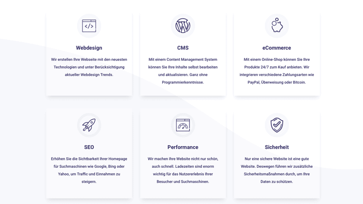
The pulse effect is a relatively simple but impressive way to draw the visitor’s attention to a certain element. So we implemented the pulse effect on our website Swish Webdesign:
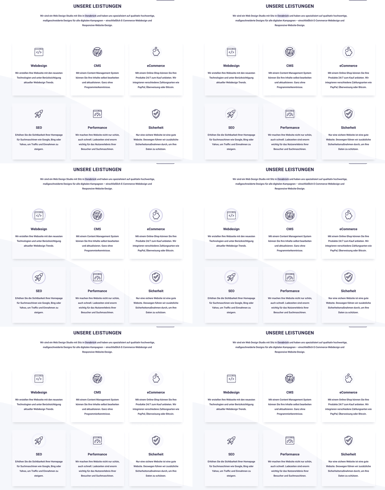

Looks pretty cool, right?
Now let’s take a look and see how it works.
1. First we create a new post or a new page where we want to use the effect.
2. now we add the information text module . You can use one module or several next to each other, like in our example – it’s up to you.
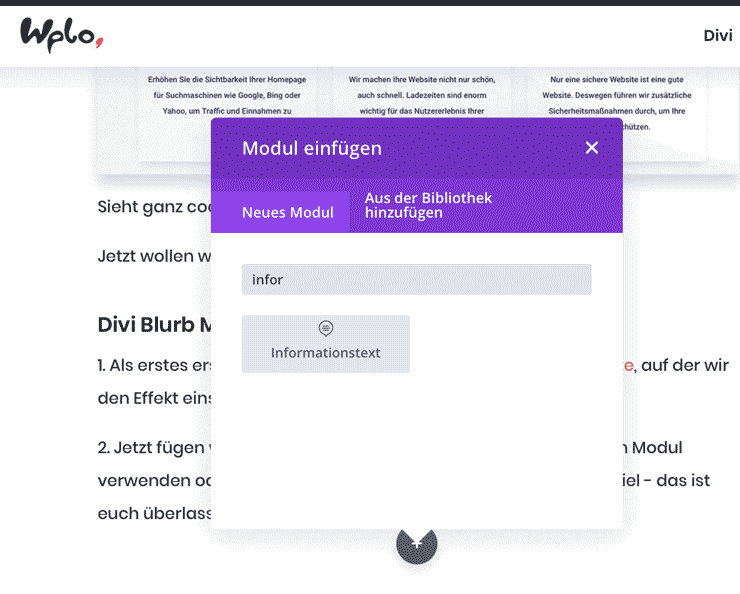

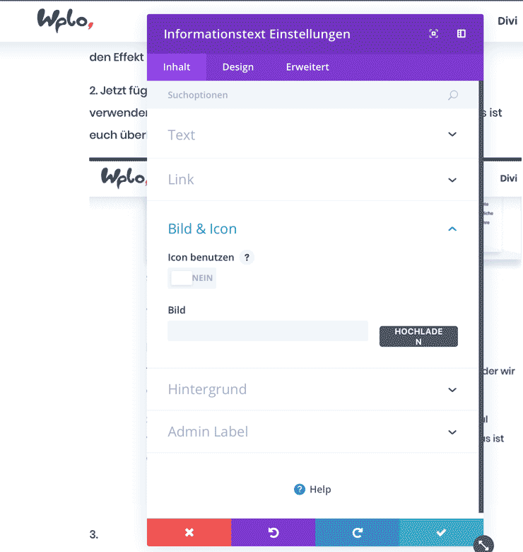
3. in the module settings we upload our icon as an image file. Our image is 100x100px in size.

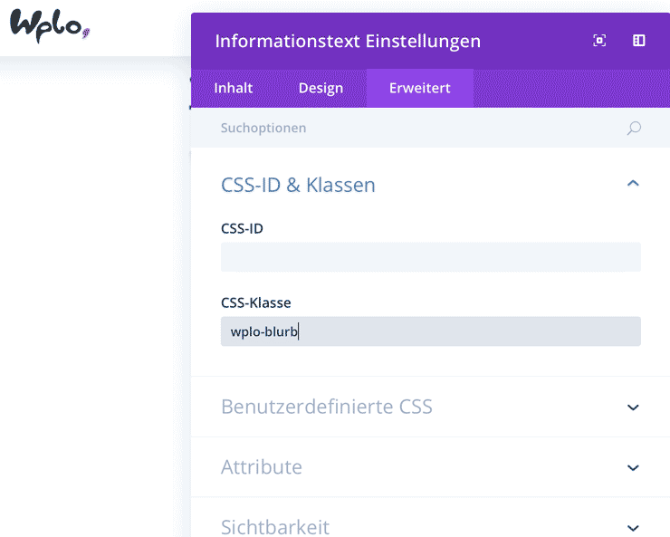
4. we then assign the CSS class “wplo-blurb” under the “Advanced” tab.

pulse effect CSS
Now only the CSS code is missing. If you’re still unsure about including CSS code, have a look at the Video-Tutorial There I show step by step how to use the pulse effect and how to make individual adjustments.
The following CSS code must be inserted into the field Custom CSS or your Divi Child Theme:
.wplo-blurb .et_pb_main_blurb_image img {
animation: pulse 2s infinite;
border-radius: 50%;
}
@-webkit-keyframes pulse {
0% {
-webkit-box-shadow: 0 0 0 0 rgba(85,73,187, 0.5);
}
70% {
-webkit-box-shadow: 0 0 0 12px rgba(85,73,187, 0);
}
100% {
-webkit-box-shadow: 0 0 0 0 rgba(85,73,187, 0);
}
}
@keyframes pulse {
0% {
-moz-box-shadow: 0 0 0 0 rgba(85,73,187, 0.5);
box-shadow: 0 0 0 0 rgba(85,73,187, 0.4);
}
70% {
-moz-box-shadow: 0 0 0 12px rgba(85,73,187, 0);
box-shadow: 0 0 0 12px rgba(85,73,187, 0);
}
100% {
-moz-box-shadow: 0 0 0 0 rgba(85,73,187, 0);
box-shadow: 0 0 0 0 rgba(85,73,187, 0);
}
}
Questions?
Suggestions for improvement or suggestions for further articles? Then use the comment function below this post!
We can also do the tutorial for you. Make a request for this



Comments