The mouseover or hover effect is a great way to enhance elements. In this article we show how a black and white hover effect for images and photos can be implemented with CSS.
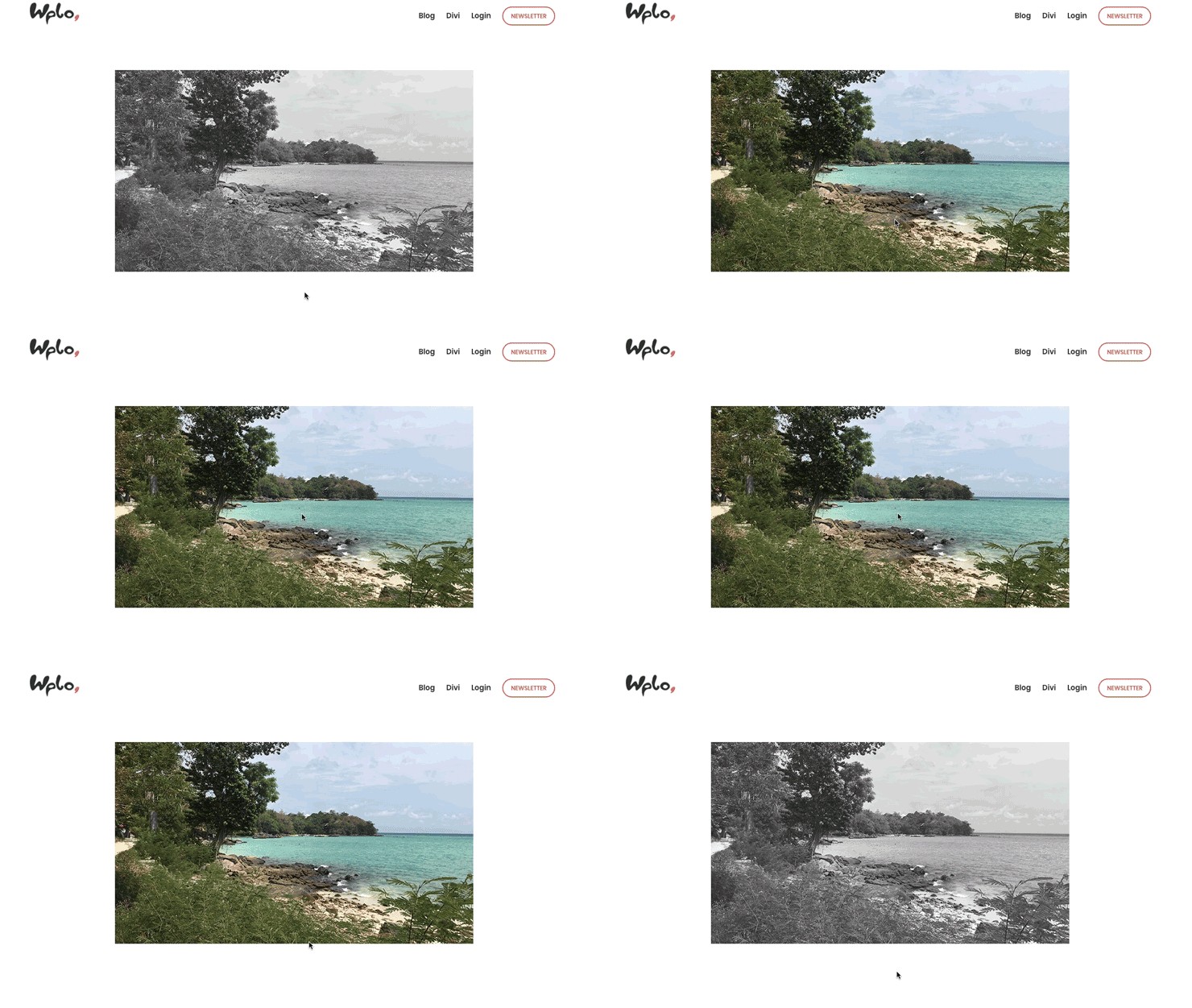

Hover effect: images from color to black and white with CSS
For this effect we first add a new image module and upload our photo in color. Then we click on the tab Advanced


In the field CSS-Class we enter grayscale and save the change.


Now you only have to insert the following code snippet into the field user defined CSS:
.grayscale img {
-webkit-filter: grayscale(0%);
filter: grayscale(0%);
opacity: 1;
}
.grayscale img:hover {
-webkit-filter: grayscale(100%);
filter: grayscale(100%);
opacity: 0.9;
}
That’s about it. Note that the effect only occurs if you assign the CSS class grayscale to the image module. For each image where the hover effect should be applied, the CSS class has to be defined separately.
The effect has the following effect:


Hover effect: images from black and white to color with CSS
Of course we can also reverse the effect. To do this, we upload a colored image again. Due to the CSS code the image will be displayed in black and white. If you move the mouse over it, it gets its color back. As CSS class we define here colorize.
Then the following code snippet must be inserted into the field user defined CSS :
.colorize img {
-webkit-filter: grayscale(100%);
filter: grayscale(100%);
opacity: .9;
}
.colorize img:hover {
-webkit-filter: grayscale(0%);
filter: grayscale(0%);
opacity: 1;
}
Any questions? Suggestions for improvement or suggestions for further articles? Then write it in the comments.






Comments